The Science Behind Using Images In Your E-Commerce Marketing Materials
This is a guest post from Syte.ai.
The trend toward better visuals in e-commerce is here to stay. Social media, shopping sites, and even digital-media outlets embracing more and more high-quality images in order to appeal to consumers online is not a passing phase.
With the barriers to switching among products and services being so low, companies need to be as creative as possible to stand out from the crowd. Visuals are the front lines for capturing consumer attention.
We’re going to show you—based on actual studies—how images and visuals affect consumers, and what that means for your e-commerce marketing materials.
This is why your brain loves visuals.
The brain is built to process visuals, cruising through visual information up to 60,000 times faster than text. This means that when you skim through your Facebook feed, a news article that a friend has forwarded to you, your Instagram feed, or a company’s dashboard — you’re going to notice and absorb information from any visuals present before you process larger chunks of text. How often have you tried to describe an article you read, only to forget the title but remember the main picture(s) instead?
Images stick in our heads with tenacity—it’s a fact. One study found that 80% of consumers are able to recall a video ad they viewed in the past 30 days. According to SmallBizTrends, 92% of mobile video consumers are apt to share videos among their peers. This isn’t surprising to those who are aware of the way that the brain has been proven to quickly engage with and hold onto pictures over words. This is a widely studied phenomenon known as the picture superiority effect.
We are happier and more apt to engage with content that includes visuals. This includes everything from static images to more complex formats for social media like carousels and collections of images.
Both of these images are part of the same Instagram ad.
This also encompasses product videos, disappearing videos like Instagram and Snapchat Stories, and even press releases in journalism. Visuals in all forms are more likely to lead to customer conversion.
The fad of visuals, videos, and graphics is part of our evolution. Just as we developed our visual processing to dominate our environment, we’re evolving the web to appeal to us as it has come to dominate our lives.
Why targeted visuals are crucial for ads today
Long gone are the half pages full of ad copy. Today, because advertisers are starting to understand how hard-wired we are to pay attention to images, they’re tailoring their digital presence accordingly. The web is starting to look a lot different. Now, highly visual social platforms like Instagram are major hubs for ads. In 2018, Instagram was the fastest growing social media platform. Brands are shifting. They realize they need to harness the power of images to evoke a valuable response from customers.
Just using any old images isn’t enough. Consumers today want brand images to look good to them and fit their feeds. What works as an image for an urban father of three isn’t going to work for an outdoorsy college girl, even if they’re both interested in your organic vegan product.
Visual advertising can be very effective when it plays into viewers’ emotions, whether that’s childhood nostalgia, romance, or even political leaning—as well as the specifics of viewers’ daily routines. The key to unlocking the true potential of images in advertising is to understand and reflect your audience in the pictures you show them.
Take this ad for Uber. Although Uber offers rides worldwide, this ad is particularly relevant for those living in New York and New Jersey.
Although the graphics aren’t dramatic, they play to viewers’ desire for order and efficiency in a normal, tumultuous day. In order to get the right images on the right feeds, anyone advertising on social should use targeted image advertising. This means relying on technology that can recognize images, logos, and features of images to analyze what types of things users want to see, and then leveraging that to deliver relevant ads to those users.
Pinterest, for example, has a system that works in a similar manner, which recognizes the images users are drawn to and uses similar images in ads for those users. “We are already seeing that using visual signals improves the relevancy of our ads, making advertising on Pinterest more effective for businesses and more additive and informative for your users,” said Tim Kendall, former president at Pinterest. “The future of advertising is images, not keywords.”
E-commerce visuals in emails: the secret ingredient
You also have to design e-commerce emails with users in mind. How current and potential customers interact with your email depends on why they’re receiving it to begin with (Is it a replenishment email? Are you pushing a referral program?) — and what you’re showing them. In this regard, visual elements can be particularly useful to shape your outcome.
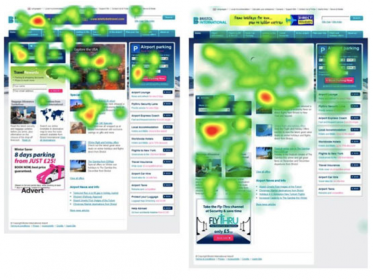
When Syte deconstructed the myth of the F-shape scan, the company talked about how viewers’ eyes are drawn to the visual elements of a page:
This means that wherever you place a visual is where the eye will go.
Smart companies like Caudalie use this to draw readers to bold visual elements that are usually accompanied by minimal text and quickly tell a viewer what’s going on:
Instead of cramming text and information about holiday promotions into this email, Caudalie delivers its details with stunning pictures of its products. You don’t need words to understand that Caudalie is offering a packaged deal, gift-wrapped for delivery to family, friends (or even yourself!). This pulls customers into shopping.
Another tip for creating email visuals that drive conversions: include product videos. The animation platform Vyond highlighted how videos can increase click-through rates by 55%. Adding videos to emails can be complicated but well worth it. Because not everyone can play embedded videos, you can also try the approach of adding captivating screenshots from your videos — or even go with animated GIFs or cinemagraphs as dynamic alternatives. These tactics will still stimulate viewers with visuals for greater engagement.
Even if you don’t include videos in your e-commerce emails, you have to have high-quality visuals of your products—from several angles, if possible. According to a recent study by Longitudes, 59% of study participants noted that multiple images of a product were more helpful in making a purchase. Whats more, 67% of respondents said that higher quality photos were even more helpful than descriptions and reviews. If you aren’t getting multiple and high quality product images for every product on every device, you’re missing sales.
Back to the future
Images are absolutely central to success in e-commerce. We see this over and over again via scientific studies, advertising studies, and conversion tracking. Because they appeal to the way that humans naturally interact with the world, photos, videos, and other visual elements help persuade online shoppers to take action.
The shift toward visuals isn’t a short-term trend, fueled by panicking advertisers. It’s how humans have been, and it’s how the web will grow to always be. Understanding this will help ensure you always craft the best and most creative marketing materials.
Latest posts by David Candelas (see all)
- Use a SMART Goal Template to Hack Your Productivity - December 11, 2020
- Is LinkedIn Worth Your Time as a Salesperson? - November 24, 2020
- Tips for Starting the Home Office of Your Dreams - November 29, 2019


